Large open living spaces offer advantages that make them a popular choice in modern homes. Natural light moves more freely throughout the home, sightlines extend farther, and adjacent areas feel connected rather than isolated. These qualities create a sense of openness that smaller compartmentalized floor plans often struggle to achieve. At the same time, openness introduces design challenges that are less noticeable in traditional rooms.
One of the most common challenges appears after the major furniture has already been selected and arranged. The room functions properly, circulation feels comfortable, and the layout supports everyday life, yet the space still lacks a sense of visual cohesion. Homeowners frequently describe the feeling as unfinished, even when the room contains everything it technically needs.
The reason has less to do with furniture and more to do with scale. Open floor plans create larger visual fields, wider walls, and longer sightlines that change how objects are perceived. Decorative elements that feel substantial in smaller rooms can appear insignificant when placed within a much larger environment. Adding more objects rarely solves that imbalance. Stronger visual anchors create a greater impact than additional decoration because they address the underlying imbalance rather than adding more visual noise.
This is where oversized artwork begins to serve a purpose beyond decoration. Large-scale pieces introduce visual structure, establish focal points, and help distribute attention throughout the room. Rather than filling empty wall space, they help define how the space is experienced.
Large Rooms Need Visual Weight
Design conversations usually focus on color, furniture styles, or decorative accessories. Those elements influence the character of a room, but visual weight determines whether the space feels balanced. Without sufficient visual weight, even well-designed interiors can feel fragmented.
A large sectional sofa may appear substantial when viewed in isolation, yet it can lose visual dominance when positioned against a long uninterrupted wall. The same principle applies to coffee tables, accent chairs, and decorative objects. As room dimensions increase, the scale of supporting design elements becomes more important.
Artwork is uniquely effective because it occupies vertical space without adding physical bulk. A properly scaled piece can influence how an entire room feels without affecting circulation, furniture placement, or functionality. This makes artwork one of the most efficient tools available for balancing large open interiors.
The relationship between scale and balance becomes even more important in homes with open-concept layouts, where individual zones must feel connected while still maintaining their own identity. In these environments, visual anchors often perform the organizational role that walls once provided.
For homeowners working with connected living, dining, and kitchen areas, many of the same principles appear in broader open-concept home design strategies, where visual structure becomes more important as physical boundaries disappear.
Why Oversized Artwork Changes the Way a Room Feels
Well-balanced rooms guide attention naturally. The eye finds a focal point, processes the surrounding environment, and gradually explores secondary details. That sequence happens quickly, yet it strongly influences whether a room feels organized or visually scattered.
Oversized artwork supports that process by providing a clear destination for attention. Instead of asking multiple decorative objects to compete for visual importance, a larger piece establishes hierarchy immediately. Furniture arrangements feel more intentional because they appear connected to something larger than themselves.
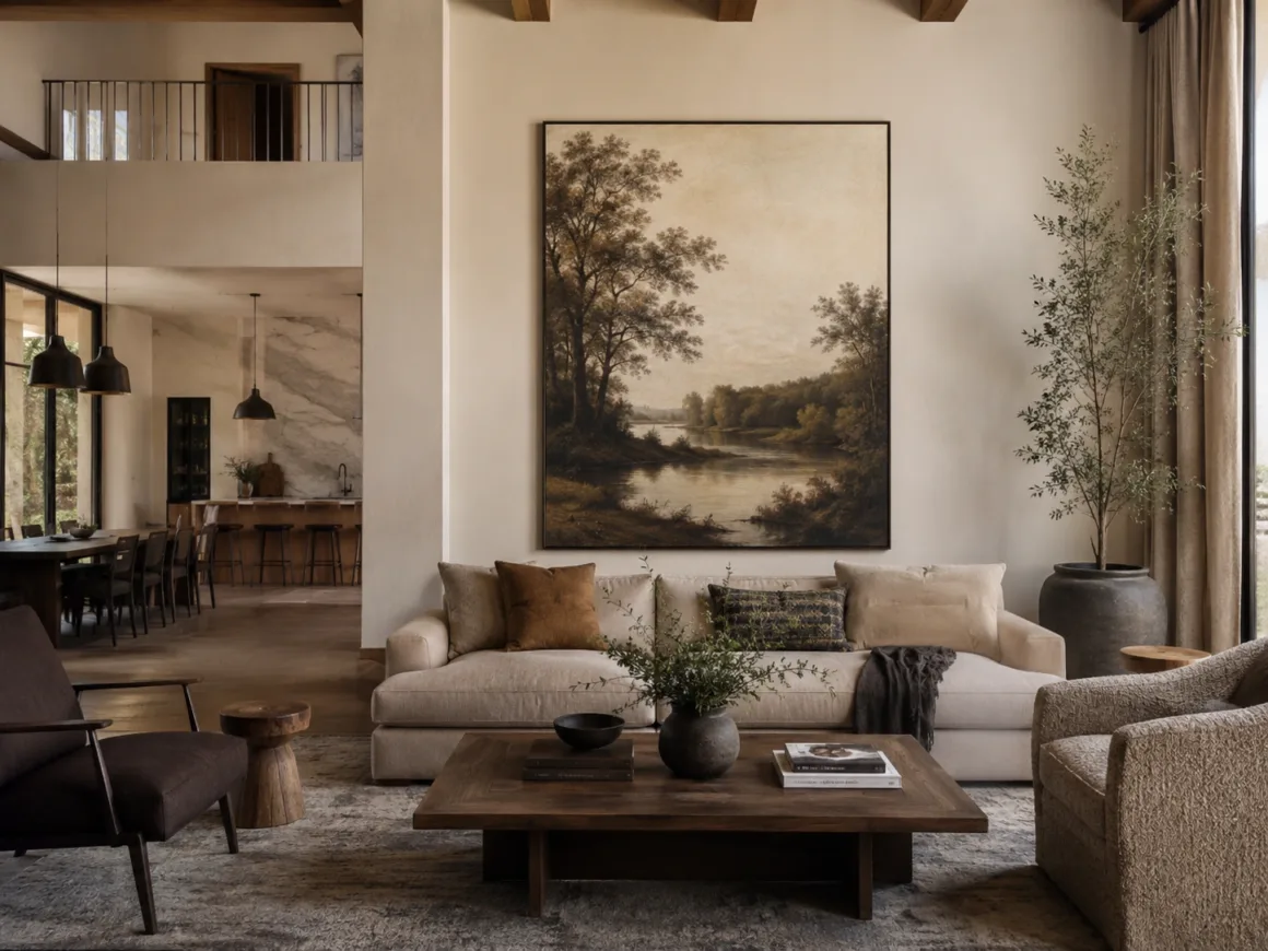
This effect becomes most apparent above large sofas, console tables, fireplaces, and expansive wall sections where smaller decorative pieces frequently appear isolated. A single substantial artwork often creates more visual order than several smaller pieces arranged together, especially when the surrounding room already contains numerous furnishings and materials competing for attention.
Artwork does not need to dominate a room to be effective. It simply needs enough visual presence to establish hierarchy and strengthen the relationship between surrounding elements.
Choosing Artwork for Scale Before Subject Matter
Artwork selection often begins with subject matter. Homeowners search for landscapes, abstracts, architectural studies, or personal interests that reflect their taste. While personal preference should always influence the final decision, scale deserves attention before any discussion about style or subject.
A beautifully framed piece that feels undersized in relation to the wall rarely contributes much to the room. The artwork may succeed on its own terms while struggling to influence the surrounding environment. In large open spaces, the relationship between artwork and architecture frequently matters more than the image itself.
This does not mean every wall requires a massive statement piece. It means artwork should be evaluated in the context of the room rather than in isolation. The same print that feels perfectly balanced in a hallway may disappear entirely when placed above a twelve-foot sofa or across from a double-height ceiling.
Designers often evaluate artwork using proportion rather than preference alone. The width of the furniture below, the dimensions of the wall, nearby architectural features, and the distance from which the artwork will be viewed all influence whether a piece feels appropriately scaled.
Once scale feels right, style decisions become easier because the artwork already occupies the visual role the room requires.
The Appeal of Vintage Prints in Contemporary Interiors
Large contemporary spaces sometimes struggle with character. Clean lines, neutral palettes, and open layouts create flexibility, yet they can also make rooms feel somewhat detached from the people living in them. Artwork frequently becomes the element that introduces personality without disrupting the architecture.
Vintage prints introduce visual depth and a sense of history that helps large contemporary spaces feel more established. They provide contrast against newer materials while helping a room feel more layered and established. The appeal extends beyond nostalgia. Vintage pieces introduce contrast that helps contemporary interiors feel more layered and visually established.
Maps, botanical illustrations, historical engravings, travel posters, and classic art reproductions all bring different qualities to a space. What they share is the ability to introduce narrative without overwhelming the room. A carefully selected vintage print often feels integrated into the environment rather than added as a decorative afterthought.
Viewing artwork within curated collections can also make scale decisions easier. Collections available through Art Heist Gallery demonstrate how framing, composition, and visual weight influence a room long before artwork reaches the wall.
Placement Mistakes That Reduce Visual Impact
Even strong artwork can struggle when placement decisions ignore proportion. One of the most common mistakes involves hanging pieces too high. Artwork positioned well above the furniture below often feels disconnected from the rest of the room, creating the impression that separate elements are competing for attention rather than working together.
Another common issue appears when homeowners underestimate the amount of wall space surrounding the artwork. Large walls can make medium-sized pieces appear much smaller than expected. The artwork itself has not changed, but the visual context around it alters how its scale is perceived.
Spacing creates similar challenges. Rooms containing numerous decorative objects, shelving displays, mirrors, and accent pieces can dilute the influence of artwork by introducing too many competing focal points. In these situations, removing visual distractions often creates a stronger result than adding more decoration.
The strongest installations feel intentional rather than crowded. They give artwork enough space to establish presence while maintaining a clear relationship with nearby furniture and architectural features.
When One Large Piece Works Better Than a Gallery Wall
Gallery walls remain popular because they offer flexibility and allow homeowners to display multiple pieces at once. In smaller rooms, they can create interest without overwhelming the space. Large open living areas, however, often benefit from a different approach.
A single oversized piece introduces clarity. Instead of dividing attention among numerous frames, the room gains a focal element capable of holding its own against expansive walls and larger furniture groupings. This simplicity becomes increasingly valuable as room dimensions increase.
That does not mean gallery walls should be avoided entirely. They can work exceptionally well in transitional spaces such as hallways, stair landings, and secondary seating areas. The primary living zone, however, frequently benefits from a stronger visual anchor capable of establishing hierarchy within the broader space.
Choosing between a gallery wall and a single statement piece ultimately depends on what the room needs. Large open spaces often require greater visual weight rather than additional visual activity.
Artwork Works Best When It Supports the Architecture
One reason artwork feels successful in some homes and strangely disconnected in others has little to do with artistic quality. The difference comes from how well the artwork responds to the architecture surrounding it. Large pieces become more convincing when they acknowledge the proportions, materials, and visual rhythm already present within the room.
A contemporary open-concept space with expansive windows and clean lines may support oversized abstract work that reinforces the simplicity of the architecture. A home with more traditional detailing may benefit from vintage prints, landscapes, or framed collections that echo the character already established by the structure itself. Neither approach is inherently superior. Successful artwork feels connected to the room rather than imported from a completely different design language, regardless of style or subject matter.
This relationship becomes increasingly important as room size increases. Large spaces leave very little opportunity to hide visual inconsistencies. Artwork that ignores its surroundings frequently feels isolated regardless of its quality, while pieces that respond to the architecture help create a more unified environment.
Creating Balance Without Adding More Furniture
When a large room feels incomplete, the instinct is frequently to add more furniture or decorative elements. Additional chairs, tables, shelving, and accessories seem like logical solutions. In practice, those additions can increase visual clutter without addressing the underlying issue.
Artwork offers a different solution because it contributes visual weight without occupying floor space. A carefully positioned statement piece can strengthen an entire seating arrangement while preserving circulation and openness. Instead of filling the room with more objects, it helps the existing furniture feel more intentional.
This distinction matters in open layouts where flexibility remains part of the appeal. Large rooms benefit from furniture arrangements that can adapt over time rather than becoming permanently crowded. Artwork helps establish identity without reducing the versatility that makes open living spaces attractive in the first place.
Homeowners exploring broader approaches to visual organization may find similar principles in wall decor planning strategies, where scale, placement, and visual hierarchy often influence the room more than the decorative objects themselves.
When Additional Decor Creates More Problems Than It Solves
Empty walls and expansive layouts can make a room feel as though something is missing, even when the space is already functional. As a result, decorative elements gradually accumulate until the room contains numerous focal points competing for attention. The problem is rarely a lack of decoration. More often, it is a lack of visual hierarchy.
Rooms with strong visual anchors rarely depend on quantity. A single oversized artwork can establish more order than multiple smaller pieces distributed throughout the room. The objective is not to eliminate personality but to concentrate visual attention where it will have the greatest impact.
Restraint also allows architectural features, furniture, lighting, and artwork to work together rather than competing for dominance. When every element is trying to become the focal point, none of them succeed. Large spaces generally benefit from clearer hierarchy and fewer competing priorities.
Conclusion
Oversized artwork succeeds in large open living spaces because it addresses a challenge that furniture alone cannot always solve. Open layouts create broader visual fields, longer sightlines, and larger wall surfaces that require stronger anchors to feel organized. When artwork is selected with scale in mind and positioned in relation to the surrounding architecture, it becomes more than decoration. It helps define how the room is experienced.
The most successful spaces rarely depend on filling every wall or adding more furniture than necessary. They rely on a clear sense of visual hierarchy, thoughtful proportion, and focal points capable of bringing the room together. In many large interiors, a single well-chosen artwork accomplishes that task more effectively than an entire collection of smaller decorative additions.
Frequently Asked Questions
How Do You Know When Artwork Is Too Small for a Room?
A common guideline suggests artwork should occupy roughly two-thirds to three-quarters of the width of the furniture beneath it. Exact dimensions vary depending on ceiling height, wall size, and overall room proportions.
Is One Large Piece Better Than a Gallery Wall?
They can be, but large open spaces often benefit more from a single statement piece that establishes a stronger focal point. Gallery walls frequently perform better in transitional areas such as hallways, staircases, or secondary seating zones.
Can Vintage Prints Work Alongside Contemporary Furniture?
Yes. Vintage prints often create contrast that helps contemporary interiors feel more layered and visually established. Their effectiveness depends less on age and more on scale, framing, and how they relate to the surrounding architecture.
Can oversized artwork make a room feel smaller?
Artwork that is appropriately scaled to the room typically strengthens visual balance rather than making a space feel smaller. Problems usually occur when scale relationships between the artwork, furniture, and surrounding walls feel inconsistent.
Author & Editorial Review
Author: Perla Irish is a design and home living writer specialising in interior materials, furniture performance, and long-term home decision-making. View her published work at Muck Rack.
Editorial Review: This article was reviewed by the HouseSumo Editorial Board to ensure clarity, neutrality, factual accuracy, and alignment with long-term interior sustainability principles. Content is evaluated for long-term usefulness rather than promotional intent.

 2")


